


User Research
Journey Map
Storyboards
Paper Protoype
Overview
Wireframes
High-Fi Mockups
Sitemap
Design Requirements
Personas
Evaluation
RESEARCH FINDINGS


To empathize with our target users, we conducted user research with University of Washington students who live in apartments near the University of Washington and commute by walking. User research helped us understand user motivations, goals, desires, and pain points when commuting. After compiling and analyzing the data from the interviews, we generated insights that contributed to the making of our personas.
The three main takeaways from our user research were:
-
Participants were afraid of commuting the Ave at night
-
Participants felt safer commuting the Ave in groups
-
Some participants shared how they wanted an app to help them save time commuting with the unreliability of the bus system.
PERSONAS


Based on the research findings, we created two polished personas to help us personify our two main user groups. The first persona, Meg, presents the pains, desires, and goals of a target user who is concerned about their safety while commuting the Ave. Our second most prominent user group was showcased by the persona of Max, a student who is looking to save time while commuting the Ave. From our user research, we decided on a scenario for a possible experience that our targeted users might go through. We decided to focus on designing for college students similar to Meg as concern for safety was a common concern amongst most of our research participants. This scenario served as the timeline for our user journey map.
JOURNEY MAP

The user journey map followed the same scenario that Meg's persona presented. The map focuses on the user’s emotional experience as they follow each phase in the scenario. The map helped orient our design thinking with the user’s context. The journey map also reminded us to prioritize our users’ needs and actions before our biases. After aligning ourselves with the user group, we proceeded to the design stage to ideate how to assist them.


Overview
Paper Protoype
Storyboards
Journey Map
User Research


Wireframes
High-Fi Mockups
Personas
Design Requirements
Sitemap
Evaluation
DESIGN REQUIREMENTS


From our user research, we created a list of design requirements that must be supported by our product in order to satisfy user needs and expectations. Design requirements are the actions and data needed to support user needs in the final design. This step helps direct ideation by providing a framework of requirements to consider when thinking of features for our final design.
Main requirements:
-
Allow users to get immediate support when put in an unsafe or uncomfortable position
-
Allow users to see real-time data for where other people are located
-
Allow users to plan a route that avoids dangerous sections of the Ave
STORYBOARDS


Once we finalized the design requirements, we constructed storyboards that simulate a possible scenario in which a user might interact with our product. Storyboards help contextualize when, how, and why a user could interact with our product. My storyboard follows a person who feels uncomfortable walking alone so he pulls out our app to press a button that automatically allows him to call his friend to let them know he wants company. The storyboards helped us figure out the most important requirements in the making of the information architecture diagram.
INFORMATION ARCHITECTURE


The information architecture diagram is a hierarchical structure that organizes the features of the product. Design requirements were translated into necessary features of the app and were then placed as branches of the information architecture tree. Organizing the necessary features in this way facilitated the making of our paper prototype by listing groups of features necessary for each screen.


PAPER PROTOTYPE


We then created a paper prototype of our product based off of the information architecture diagram. The paper prototype was made crudely using materials such as printer paper, sticky notes, and markers. The paper prototype supports key actions that the user should be able to perform in their scenario. Therefore, only the main screens of the app were prototyped. The prototype was made for the purpose of conducting evaluative tests. We simulated interactions such as clicking a button and swiping a bar using objects such as sticky notes.
QUICK EVALUATION
Then, we each conducted evaluative tests with people outside of the Human Centered Design and Engineering department to evaluate the usability of our paper prototype. We had each participant perform three tasks while they verbalized their thoughts about the process. After each member conducted a test, we compiled our findings and considered them when revising our product design in the creation of wireframes.
WIREFRAMES

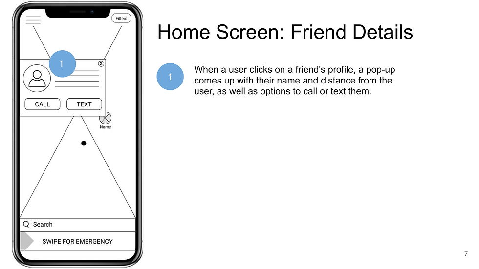

We then constructed wireframes for the entire mobile app. Wireframes draft the visual layout of app screens without focusing too heavily on minor details. Feedback from the evaluative tests on our paper prototypes helped direct layout decisions. Each screen was annotated to clarify aspects of the design that were not obvious. These wireframes served as a draft for our high-fidelity mock-up screens.
HIGH-FIDELITY MOCK UP


We culminated the project by creating high-fidelity mock-ups of key screens in our app. These screens were our vision of what the final product will look like. Wireframe layouts were referenced in the creation of these mock-ups and we referenced existing products like Google Maps to guide our aesthetic decisions.
Reflection

This project was my group's first experience with user-centered design. This led to us having to spend more time getting started with a project, whether it be looking over examples from previous classes, figuring out what the "first steps" we should take are, or deciding on which design platform to use (e.g. Figma, Canva, Sketch).
Perhaps the biggest challenge I faced in the project was organizing how we collaborated. We had a hard time separating tasks so that each team member received an equal workload. This led to issues where one person would be spending much more time on a project than others. This contributed to general inefficiency with getting a project finished. Especially with regard to design projects, collaboration was difficult because of two factors: 1. Some design tools that we used did not support simultaneous collaboration; 2. Team members had differing aesthetic standards, leading to inconsistent design choices that ultimately had to be realigned by the main designer.
Furthermore, the relative broadness of the project vision immediately became a challenge as we found difficulty in finding commonalities among a wide set of people. This, combined with limited iterations of user research, led to us having a difficult time identifying the characteristics of our user group. With less concrete characteristics, our persona became more generalized. Consequently, it became debatable whether the final product truly addressed our users' needs.
If we had more time, we would've spent more time deciding on the initial direction of the project. This would have allowed us to probe participants with more specific questions and gain more specific insights. Furthermore, we could have used the extra time to iterate user research and explore different methods such as writing online surveys and shadowing potential users. This would have allowed us to have a deeper understanding of our users and reduce the amount of assumptions that we had to make to proceed with the project.
Despite these challenges, however, we believe that we succeeded in this project in three ways: 1. We created a solution that supported all of the persona's needs and motivations; 2. Our polished projects were comparable in quality to examples that were given, in terms of content and aesthetics; 3. Our final product was novel, incorporating features that don't exist in existing apps.